plotly
Setup
Loading the data
library(tidyverse)## ── Attaching packages ─────────────────────────────────────── tidyverse 1.3.1 ──## ✓ ggplot2 3.3.4 ✓ purrr 0.3.4
## ✓ tibble 3.1.2 ✓ dplyr 1.0.7
## ✓ tidyr 1.1.3 ✓ stringr 1.4.0
## ✓ readr 1.4.0 ✓ forcats 0.5.1## ── Conflicts ────────────────────────────────────────── tidyverse_conflicts() ──
## x dplyr::filter() masks stats::filter()
## x dplyr::lag() masks stats::lag()library(p8105.datasets)
library(plotly)##
## Attaching package: 'plotly'## The following object is masked from 'package:ggplot2':
##
## last_plot## The following object is masked from 'package:stats':
##
## filter## The following object is masked from 'package:graphics':
##
## layoutlibrary(leaflet)data("nyc_airbnb")
nyc_airbnb_1 =
nyc_airbnb %>%
mutate(rating = review_scores_location / 2) %>%
select(neighbourhood_group, neighbourhood, rating, price, room_type, lat, long) %>%
filter(neighbourhood_group == "Manhattan",
price %in% 100:500,
room_type == "Entire home/apt") %>%
drop_na(rating)Plotly plots
Scatterplot
puts stuff on the next line str_c has created a new variable with those columns
Plotly works and looks like ggplot that requires the aesthetics to work.
nyc_airbnb_1 %>%
  mutate(
    text_label = str_c("Price: $", price, "\nRating: ", rating)) %>%
  plot_ly(x = ~lat, y = ~long, color = ~price, text = ~text_label, alpha = 0.5, type = "scatter", mode = "markers")
Boxplot
nyc_airbnb_1 %>%
  mutate(neighbourhood = fct_reorder(neighbourhood, price)) %>%
  plot_ly(y = ~price, x = ~neighbourhood, color = ~neighbourhood,
          type = "box", colors = "viridis")
Barplot
nyc_airbnb_1 %>%
  count(neighbourhood) %>%
  mutate(
    neighbourhood = fct_reorder(neighbourhood, n)) %>%
  plot_ly(x = ~neighbourhood, y = ~n, color = ~neighbourhood, type = "bar", colors = "viridis")
ggplotly
ggp_scatter =
  nyc_airbnb_1 %>%
  ggplot(aes(x = lat, y = long, color = price)) +
  geom_point()

ggplotly(ggp_scatter)
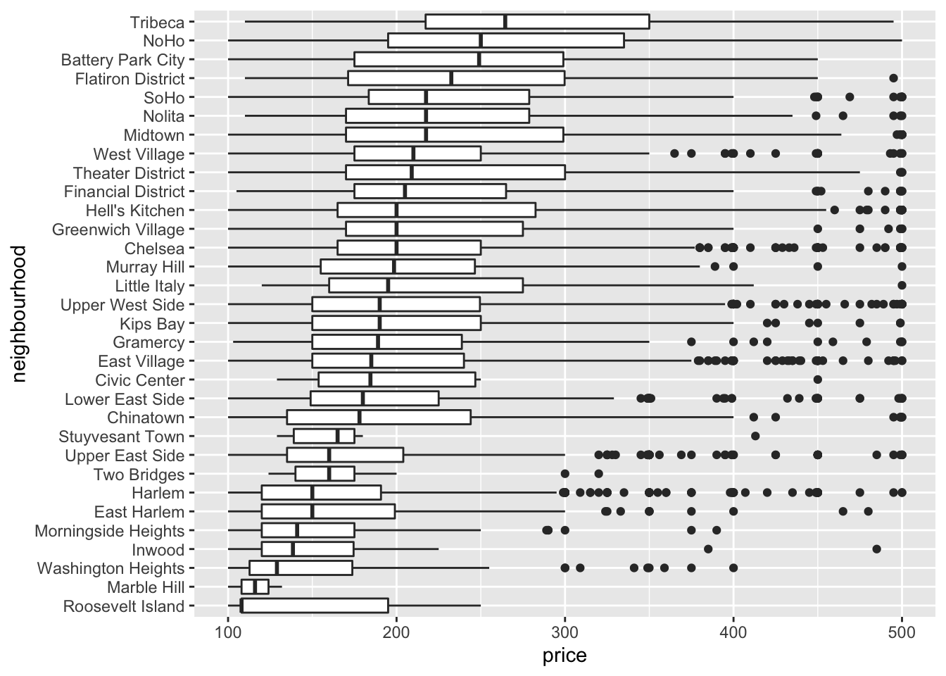
Boxplots
fct_reorder considers two variables and organizes the data in those two variables.
Boxplots
nyc_airbnb_1 %>%
  filter(
    price <1000,
    neighbourhood_group == "Manhattan") %>%
  mutate(
    neighbourhood = fct_reorder(neighbourhood, price)) %>%
  ggplot(aes(x = neighbourhood, y = price)) +
  geom_boxplot() +
  coord_flip()
Map
All of NYC
nyc_airbnb_2 =
  nyc_airbnb %>%
    mutate(rating = review_scores_location / 2) %>%
    select(neighbourhood_group, neighbourhood, rating, price, room_type, lat, long) %>%
  filter(price %in% 100:500,
         room_type == "Entire home/apt") %>%
  drop_na(rating)
Generate Leaflet map by Rating
pal = colorNumeric("magma", nyc_airbnb_2 %>% pull(rating))

nyc_airbnb_2 %>%
  leaflet() %>%
  addProviderTiles(providers$CartoDB.Positron) %>%
  addCircleMarkers(~lat, ~long, radius = 0.5, color = ~pal(rating))